Creating interactive, clean and functional graphics with aplanat
When we started creating bioinformatics tutorials for the EPI2ME Labs Notebooks environment the desire to create interactive plots for our users quickly arose. There are a variety of plotting libraries available for the Python programming language, each with various pros and cons. We had some particular requirements:
- basic interactivity out of the box: things like panning and zooming
- support for more advanced interactivity like tooltips and data highlighting
- inline display in JupyterLab notebooks
- minimal boilerplate code
- ability to embed plots in a standalone document
The first three of these are fairly self-explanatory; we wanted EPI2ME Labs users to explore a plot created and displayed in a JupyterLab notebook. Requirement 4. stems from the fact we did not want our tutorial notebooks to become stuffed full of extraneous code. The focus of the notebooks was to be how to manipulate nanopore sequencing data and analyses not how to plot a specific chart. We did however want to show all the plotting code for our users to follow along.
There were two short-listed candidates to fulfill these aims: bokeh and plotly. Bokeh is an open-source, community developed Javascript library with an associated Python interface:
[Bokeh’s] goal is to provide elegant, concise construction of versatile graphics, and to extend this capability with high-performance interactivity over very large or streaming datasets.
Plotly is also an open-source graphing library developed and maintained by a company of the same name which develops also paid-for products.
plotly.py is an interactive, open-source, and browser-based graphing library for Python. Built on top of plotly.js, plotly.py is a high-level, declarative charting library.
From the outside there’s no clear winner between plotly and bokeh, and certainly the fact that both have large, lively communities around them indicates that both are a good choice for a modern plotting library in Python.
Choosing between plotly and bokeh
So which should we use? Aside from subjective arguments around visual appearance there appears to be little to choose between bokeh and plotly.
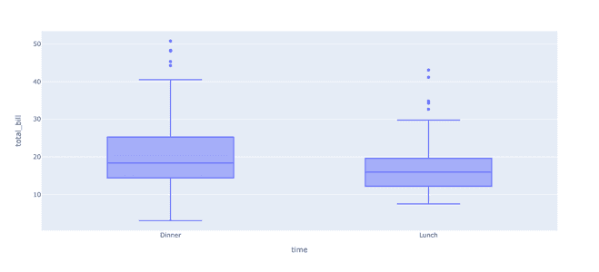
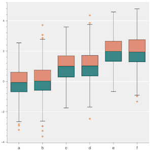
After a little research and prototyping one thing that stands out as a benefit of plotly over bokeh is the more high-level nature of its programming interface. For example lets compare the examples for creating boxplots with each library. This is a common plot type in the field of bioinformatics where we want to summarize one of more distributions of data.
For this task plotly comes with its express interface:
Plotly Express is the easy-to-use, high-level interface to Plotly, which operates on a variety of types of data and produces easy-to-style figures.
Following the example we can produce a plot across multiple facets of the data with only four lines of code:

Similarly the bokeh documentation shows how to produce:

with rather a lot more code. We should say however that bokeh has deliberately
focussed on providing the highest quality plotting primitives rather than bundling
templates for every conceivable plot type. For more templated plots in the vein
of plotly.express the holoviews package can be used, the documentation for which
contains a boxplot example
So it was primarily for this ease of plotting, from a single software package, with little boilerplate that we chose plotly for the first prototypes of EPI2ME Labs notebooks.
Reversing our decision
Early users of EPI2ME Labs will remember that we originally pointed people to Google Colab as a front-end to our notebooks. We detailed in a previous blog post why we originally made this recommendation and why we ultimately moved away from Colab.
When using plotly with Colab and EPI2ME Labs we quickly found that plotly would fail to plot the volume of data that we were requesting of it. These were not large datasets, and we anticipated that our users would want to plot far larger datasets. The plotting would often fail with obscure error messages; not helpful when you are trying to build bioinformatics tutorials for non-specialists.
Bokeh on the otherhand seemed always to reliably produce plots from whatever data we through at it. It remained responsive with large datasets. So for almost this reason alone (and because bokeh plots do look nice 😀 ) we reversed our previous decision and switched to using bokeh.
Making bokeh useable (for us)
Having been somewhat coerced, but by no means forced, to used bokeh over plotly we wanted to make it somewhat simple to use for basic plot types, particularly in the context of JupyterLab notebooks.
At this point we could have tried to use holoviews for our plotting needs, afterall the reason we chose plotly over bokeh in the first place was the lack of high-level plotting commands which is what holoviews brings to bokeh. However, after a few days using holoviews we found it lacking. There wasn’t any big gotcha or flaw in holoviews but just lots of small aspects where it didn’t really make things too much simpler than using bokeh directly.
So what did we do? Well we did something we wouldn’t ordinarily condone: we made yet another plotting interface in Python, aplanat. Please forgive the nerdy joke name, it was funny for one afternoon at least!
Aplanat provides a wrappers (templates) around the bokeh library to simplify the plotting of common plots, with a particular focus on producing plots in Juypyter notebook environments.
Developing Aplanat
Making the decision to wrap bokeh in a higher level interface was not taken lightly. In doing so we had to consider all the things we didn’t like about existing plotting libraries (and their are lots of things to dislike), and try to make our design not fall foul of the same issues.
One quickly realises why the authors of previous efforts ended up with the designs that they have. Sometimes its for wanting integration with other libraries (commonly pandas in Python), or sometimes for making hard things easy. With aplanat we had a clear goal:
Aplanat attempts to make constructing common plots as simple as possible by translating directly a users inputs into displayed data.
It has the aim to produce plots in a consistent manner with amongst other behaviours sane defaults, sizing, layouts, and styling. It explicitely does not try to be too clever with data, though some allowance is made for plotting grids of plots for multi-facetted data.
Plotting in aplanat
We won’t detail how to use aplanat here, for one thing we are very conscience of the fact that there’s no particularly good reason anyone would or should necessarily want to use it. For example, after the initial development of aplanat we became aware of chartify, which serves a similar purpose. We will however take the liberty of highlighting some of its features which enable a consistent user experience across EPI2ME Labs notebooks and workflows.
As mentioned above aplanat’s aim was to make simple things simple. To this end we have plotting functions to plot data in the forms of lines, points, bars, etc., together with utility functions to perform common data transforms like kernel density estimates (an alternative to histograms). All plots in aplanat have a common, simple interface and provide apply a standard set of stylings and plot attributes which smooth over some (frankly bizarre) default behaviours in bokeh.
As you can see aplanat also provides an easy where to export plots for embedding into React-based websites.
Creating standalone reports
With basic plotting out of the way, a second useful feature of aplanat is producing standalone, rich, and interactive reports. Gone are the days of boring static PDF documents. These reports operate without the need for a webserver: they are single-document HTML files that can be opened in any webbrowser. All EPI2ME Labs tutorials and workflows produce a report in this form.
The reporting framework is built around two technologies: bokeh and markdown. The combination of these allows the EPI2ME Labs team to quickly turn a set of bokeh plots and explanatory text into a report document that summarises the results of a tutorial notebook or a Nextflow workflow. We can even embed third-party Javascript report elements like the Nextclade QC report element found in the wf-artic report.
The aplanat reporting framework includes also some templated components, which gives the team reusability across workflows for standard items like read quality control, read demultiplexing, and genome coverage. This functionality is similar to the ideas of the popular MultiQC tool.
Summary
The decision to create our own plotting library for EPI2ME Labs products was taken after prototyping and experimentation with existing tools. Eventually we settled on building the small aplanat library on top of bokeh. This approach is not perfect: we still sometimes find ourselves venting anger toward bokeh when developing new visualizations, but for our daily needs aplanat allows us to focus on science rather than minutia of creating attractive, useful visualizations.
The EPI2ME Labs team’s goal is to allow anyone, anywhere to analyse their Oxford Nanopore Technologies’ sequencing data.

